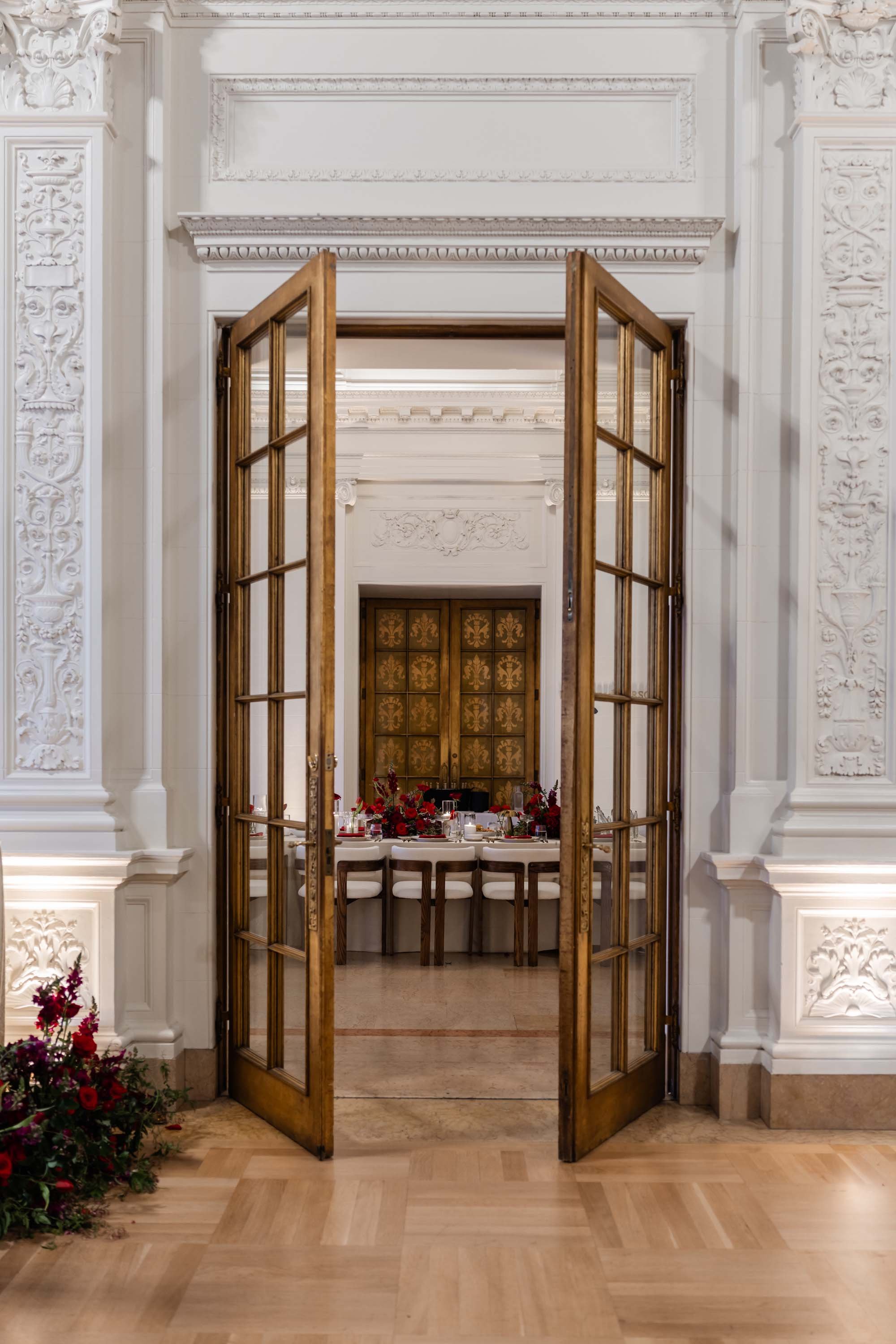
There are some color palettes that make an entrance, and this wedding at Flood Mansion was certainly one of them. Rich red florals, thoughtful layers of texture, and a few unexpected details came together to create a celebration that felt romantic, artistic, and beautifully distinctive.
Red was the defining color throughout the day, but it wasn't used in just one way. From the ceremony flowers to the reception tables and even the wedding cake, the color appeared in different forms and textures, creating a cohesive design that felt considered rather than overly coordinated.



A Ceremony Framed in Red
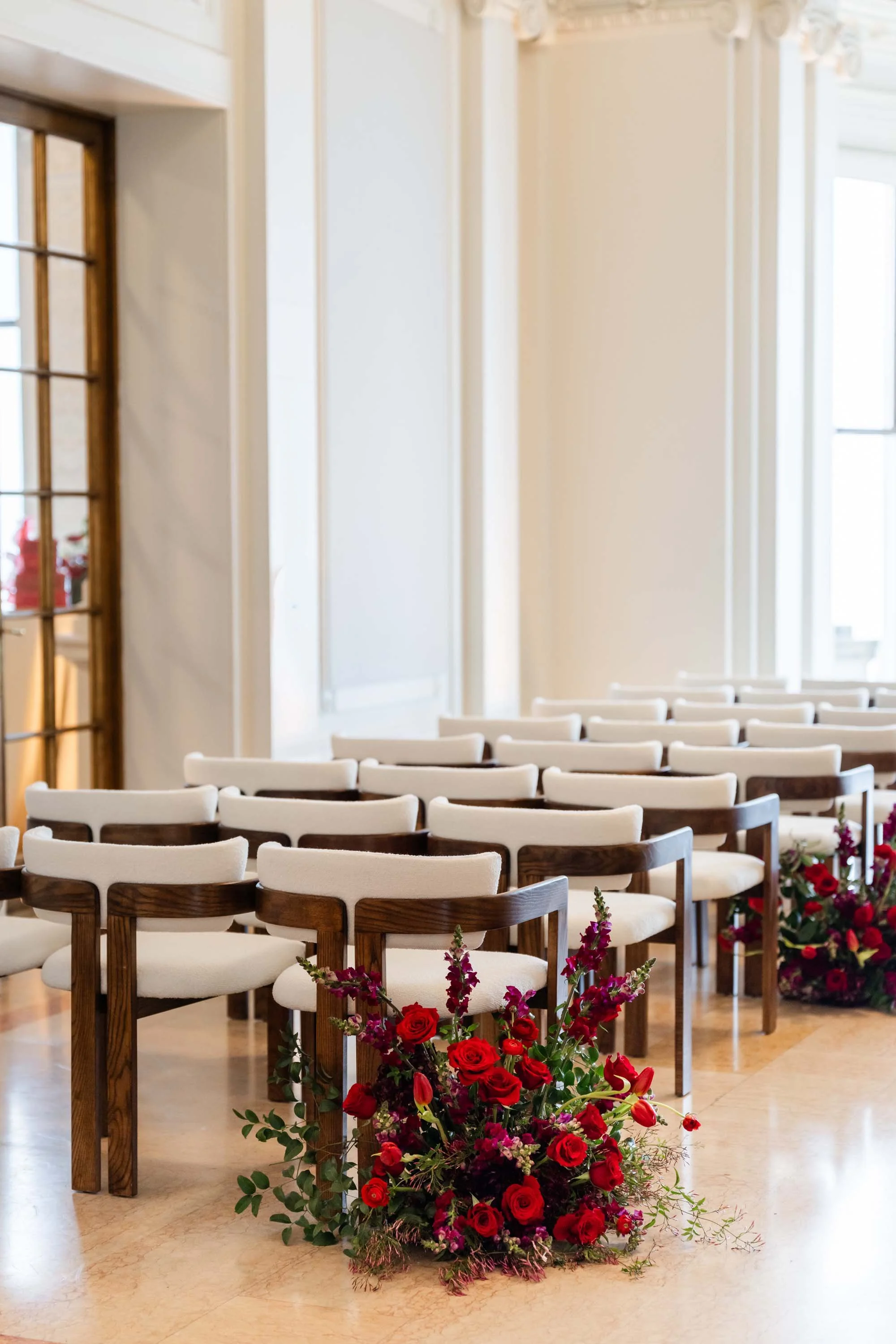
The indoor ceremony took place against a beautiful backdrop of windows, with an arch adorned in rich red florals and cascading greenery. The combination brought color and movement to the setting while allowing the architecture and natural light to remain part of the overall design.
A harpist provided the music for the ceremony, adding another lovely layer to the atmosphere. The bride wore a lace gown with long lace sleeves, while the bridesmaids wore soft tan dresses — a subtle neutral contrast to the bold floral palette.
I loved the balance here. The red florals made a statement, but the greenery softened the arrangements and added a natural element that kept the design from feeling too formal.


The Art of Layering Color
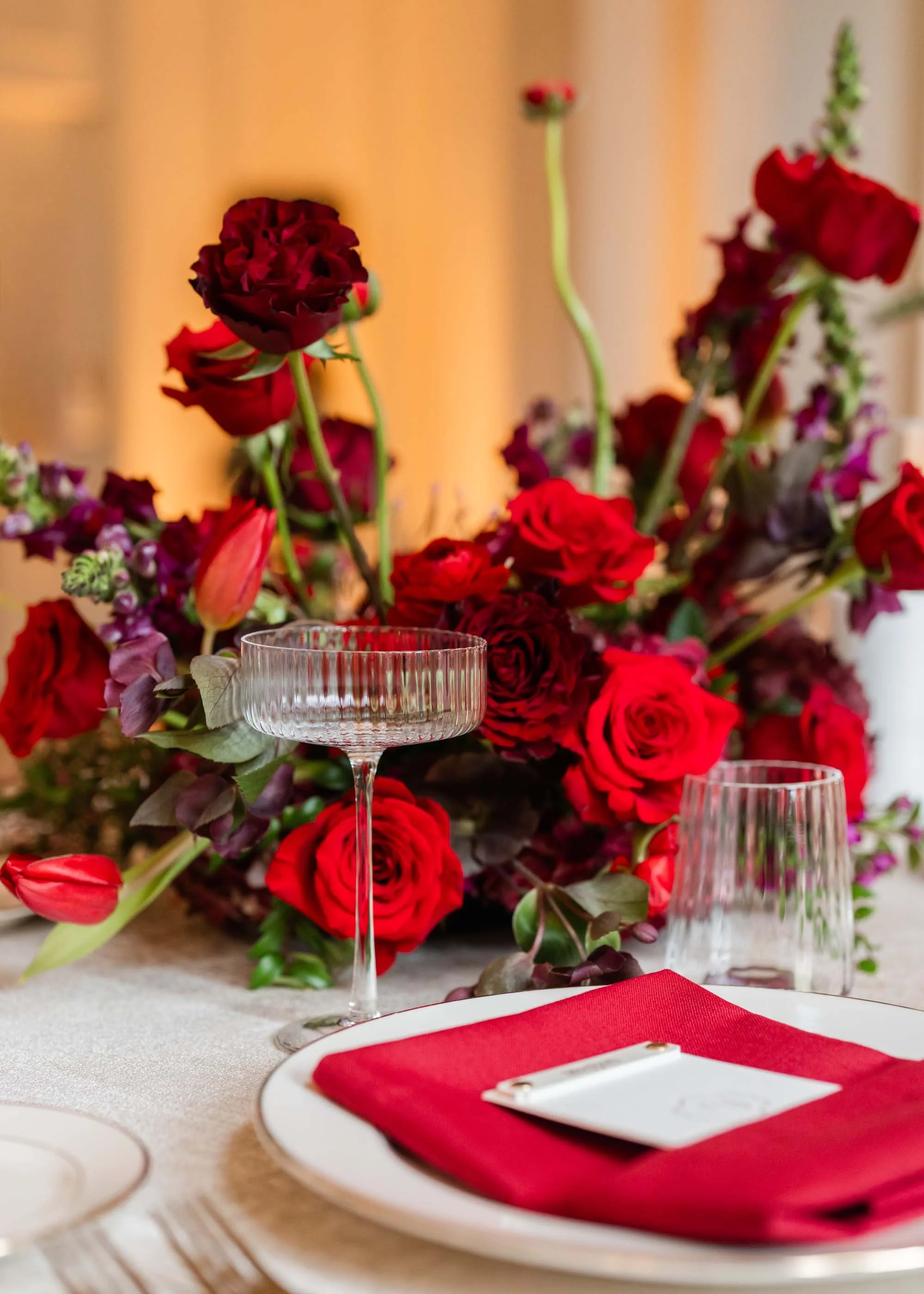
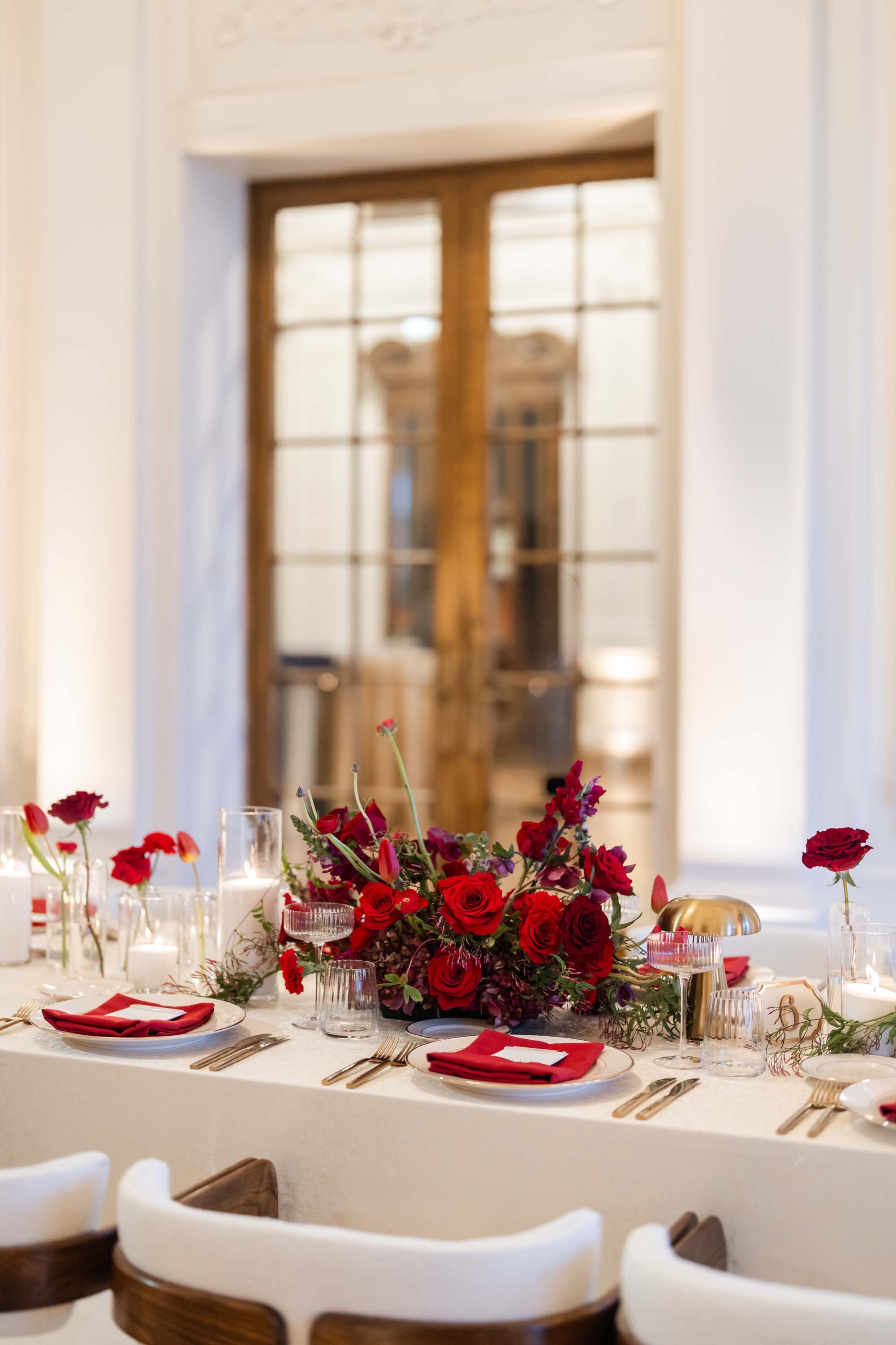
One of my favorite things about working with a strong color palette is finding ways to give it depth. At first glance, these arrangements read as rich red, full of texture and movement. But look a little closer and you'll notice delicate accents of purple woven throughout the flowers.
Those small touches made such a difference. Rather than relying on a single shade of red, the floral design brought together subtle variations in tone, allowing the arrangements to feel layered and artistic. The purple wasn't meant to compete with the red; it simply added another dimension, revealing itself as you got closer.
It's a reminder that sometimes the most interesting details aren't the ones you notice first.
A Reception with a Bold Point of View
The reception continued the color story with crisp white linens, red menus, and striking red floral arrangements accented with greenery. The contrast was beautiful: a clean, bright foundation paired with a color that brought plenty of personality to the tables.
During cocktail hour, neutral tan linens covered the tall cocktail tables, with red floral arrangements carrying the palette into the space. I loved how the softer tones connected with the bridesmaids' dresses while allowing the flowers to remain the focal point.
Repeating a color throughout different parts of a wedding doesn't mean every space needs to look identical. It's about creating little visual connections — a floral color here, a linen choice there, a printed detail that brings everything together.


A Wedding Cake in Full Color
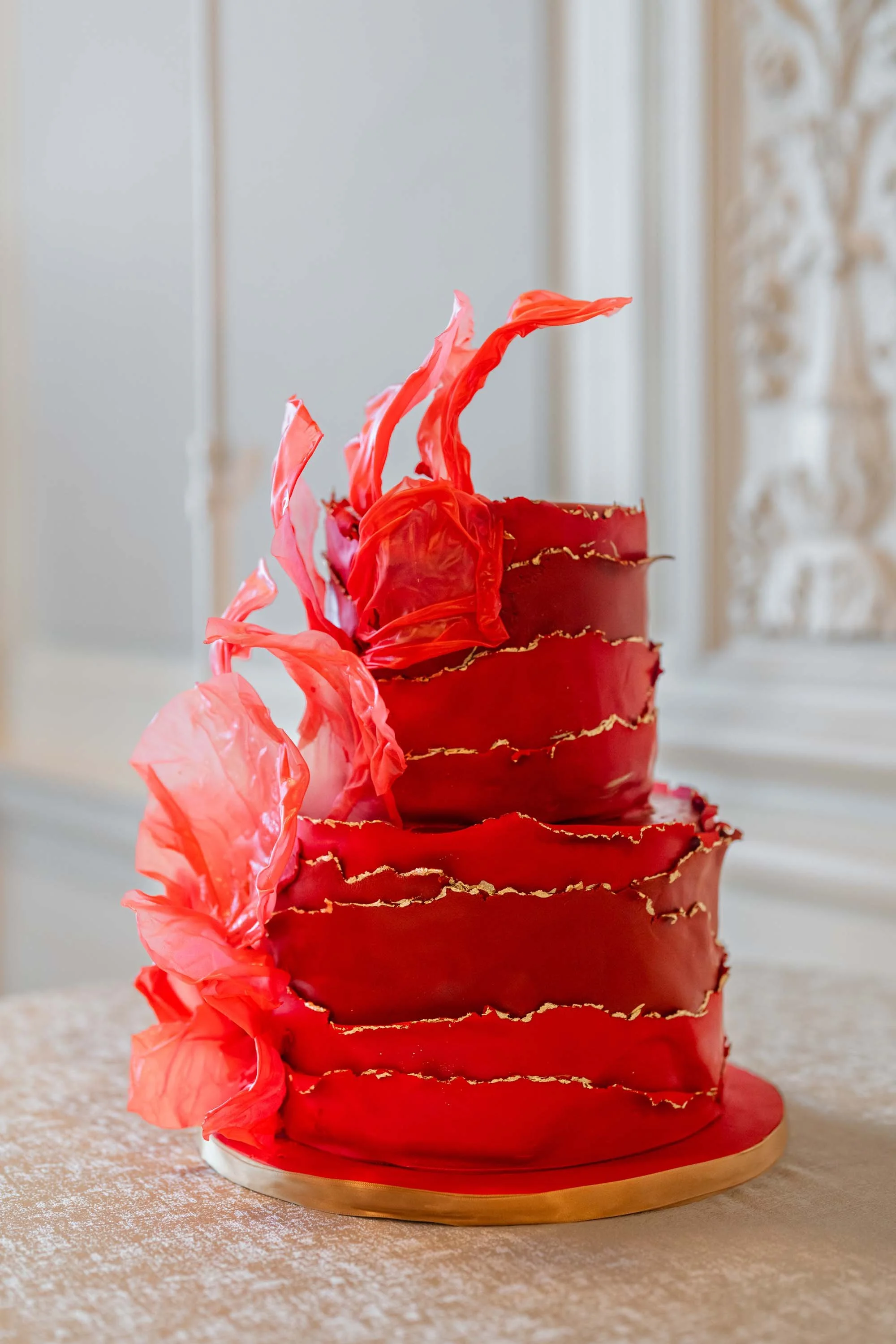
And then there was the cake: a beautiful, all-red tiered design that continued the color story in the most memorable way.
It was a confident choice, and I loved that the couple carried the palette all the way through to this final detail. Against the more neutral elements of the reception, the cake felt like a natural extension of the design rather than an afterthought.
This Flood Mansion wedding was such a beautiful example of what can happen when a couple embraces color with intention. The red made an immediate impression, but it was the thoughtful layering — the greenery, the subtle purple accents, the neutral linens, and the beautiful details throughout — that made the overall design feel so complete.
For me, that's always the goal with wedding flowers: creating something that makes an impression from across the room, but rewards a closer look, too.
Planning a wedding in San Francisco or Napa Valley? I would love to help you create a floral design with its own point of view — one that feels personal, thoughtful, and completely your own. Get in touch to start the conversation.